Generating leads is a crucial component of your marketing strategy (or at least it should be). It should be an essential part of your funnel and the more effectively you do it the more money you’ll likely make. It’s really just that simple.
Do you know the secret of creating a good opt-in landing page? Here are some tips and best practices to help along with an example of a bad landing page, a mediocre landing page, and a good landing page.
A landing page should focus on a singular purpose, like promoting a webinar, getting a free ebook or free trial, or encouraging people to provide their email address and other information in exchange for the offer you are promoting.
Start by knowing your goal: the action you want people to take when they get to the landing page. 99% of the time we recommend that being a simple opt-in where you get the person’s name, email, etc, in exchange for what you are offering. Here are some parts you need to include to create a good opt-in landing page:
- Headline: The headline should be concise and offer a highly desirable benefit that helps solve the visitor’s problem and be congruent to the marketing message that brought the visitor to the page in the first place. Good headlines usually ask burning questions, promise pain-free results, tease a solution to a problem, or offer a guide people can’t resist.
- Subheadline: The subheadline can help you elaborate on the promise of the headline. It is a great place to reinforce the value proposition to the visitor and it can be more lengthy if necessary.
- Lead Magnet: Your landing page is there to offer the visitor something which can be the lead magnet or a service or product for sale, etc. Lead magnets are a great way to give the visitor value and help you generate leads by offering an “ethical bribe” in exchange for that information.
- The opt-in Form: Less is more when it comes to trying to collect visitors’ information. Only ask for the minimum information you need to get people to sign up. Typically that could just be an email address. If you do ask for more information make those fields optional if you can. Asking for too much information off the bat turns off a lot of people. Your opt-in form should come in to view as soon as possible (above the fold).
- The Call To Action: This would typically be the clickable submit button that allows people to take you up on your offer when they enter their details. This should be something simple and enticing but not usually just the word “Submit”.
Let’s take a look at a couple of landing pages and break down some of the good and bad in each of them.
In today’s internet, 50%+ of the total traffic is mobile so it is very important that your landing page be mobile optimized and that is one factor we’ll examine with these landing pages. If you need something to create good conversion-focused, mobile-optimized landing pages then take a look at our Autoresponder/CRM package.
The first landing page I’ll review is what I would consider pretty bad overall. Take a look at it, the desktop version is on the left and the mobile version is on the right:
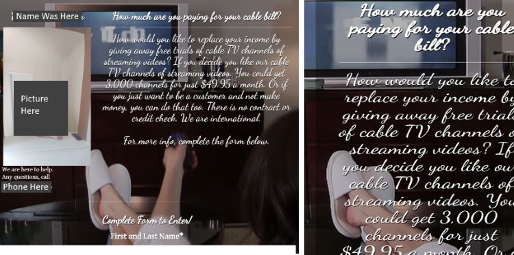
What’s Bad With This Landing Page:
- The opt-in form is way below the fold.
- The text is very difficult to read in that font.
- It’s very busy making it harder to read and hard to focus on the copy.
- It is NOT mobile optimized at all, the wording doesn’t even fit on the screen whatsoever. This would never work well with SMS Text Marketing.
What’s Good With This Landing Page:
- The ad copy is okay overall with some additional tweaking. If you broke it down into a headline, subheadline, and some extra copy it could work ok.
- They include their name, a picture, and a phone number to help instill confidence in the visitor that they are real people.
The Second Landing page is one that I would consider mediocre, again the desktop version is on the left and the mobile version is on the right:
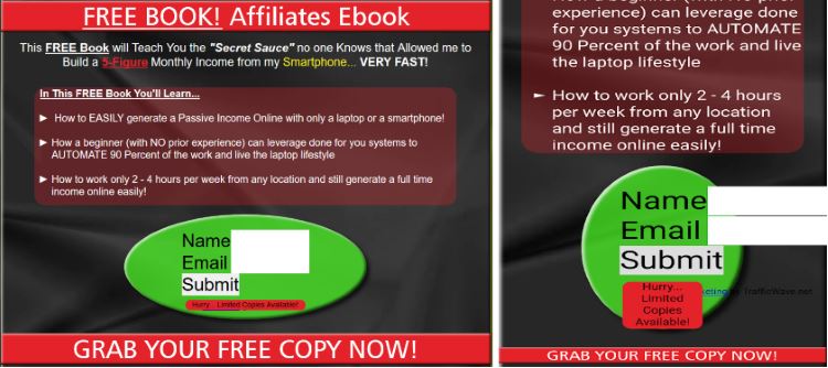
What’s Bad With This Landing Page:
- The opt-in form doesn’t render very well on desktop or mobile.
- It is NOT mobile optimized. While it looks ok on mobile, the opt-in form is a way down the page and it definitely doesn’t look like something I would fill out at all.
- The color scheme could use a bit of work in my opinion as well.
What’s Good With This Landing Page:
- The ad copy is pretty good overall. It has a decent headline which could be tweaked a bit and the subheadline is actually pretty good I feel.
- The overall ad copy gives the visitor what kind of benefits to expect and what kind of information will be in the free ebook.
- The Call to action is pretty good but I think that should be in the actual “Submit” button instead of at the bottom of the page.
Here is the last example of a landing page which I would consider pretty good overall. Again the desktop version is on the left and the mobile version on the right:
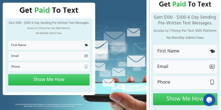
What’s Bad With This Landing Page:
- There isn’t a lot of copy but what is there is enough to convey the proper message.
- On mobile, the chat icon does cover the Call to action somewhat.
What’s Good With This Landing Page:
- The page is concise and to the point with no fluff.
- The headline is clear and simple.
- The subheadlines reiterate and reinforce the headline giving extra detail.
- The opt-in form is in clear view above the fold on desktop and mobile.
- Highly mobile optimized.
- The call to action is very clear (I would recommend testing this further).
In summary, a good landing page is very clear, concise and to the point, focusing on just one goal. The opt-in form is in view very quickly and the page is very highly mobile optimized. This is especially important in SMS Text Marketing campaigns where 99.9% of the visitors would be on a mobile device. Even with Email Marketing and General Contextual or Display Advertising, it is very important to have a mobile-optimized page as 50%+ of the traffic is mobile in today’s internet.
So, if your landing page sucks and you need help building a good one you have a few options:
- Use a good system for being able to design good conversion-focused, mobile-optimized landing pages, sales pages, and more anytime you wish. We recommend our Autoresponder/CRM.
- Utilize a professional landing page design service. Put 20+ years of experience to work for you.
- Contact us with your specific needs and we can discuss options to help you.
Please feel free to add your comment below or ask questions, etc: